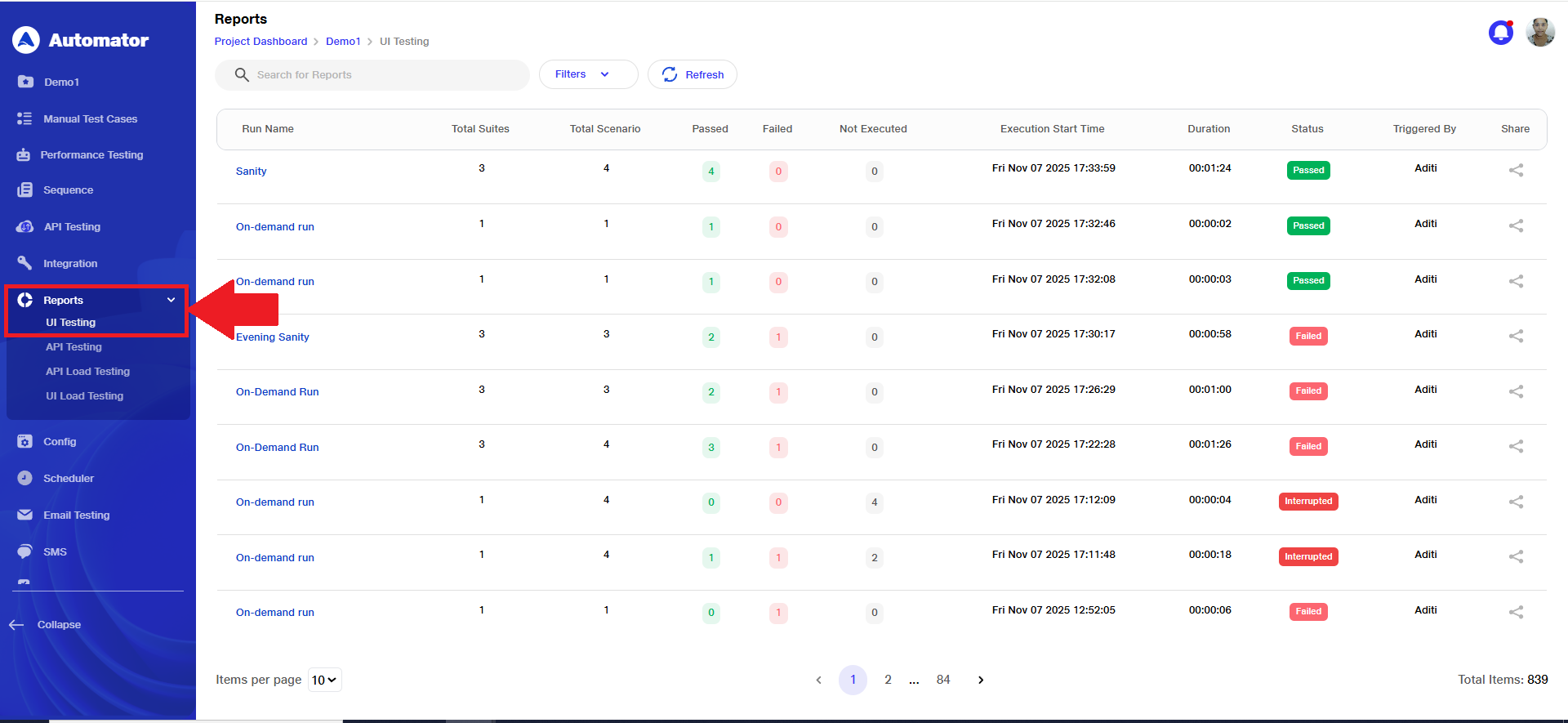
Reports
Automator offers detailed reports for both UI and API testing upon the execution of suites and scenarios, facilitating further analysis.
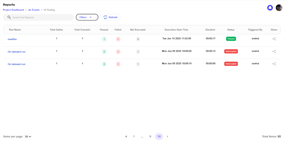
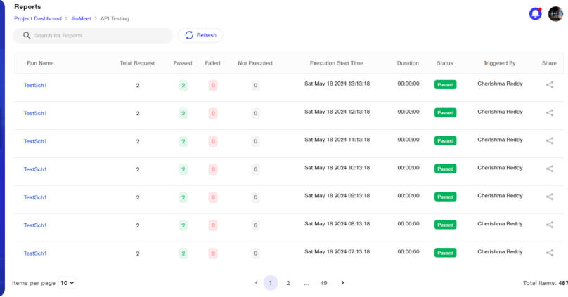
These reports furnish an overview of the total number of suites and scenarios executed, alongside the count of tests that passed, failed, or were not executed. Furthermore, they provide status of the execution process.
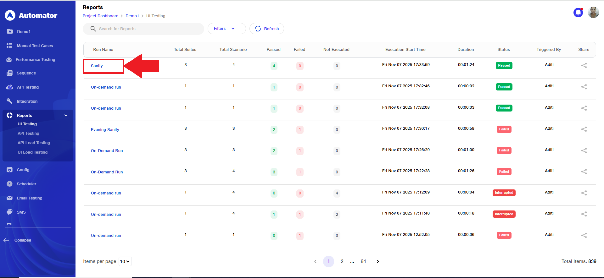
Within the reports section, users gain access to a comprehensive catalog of generated reports for various suites, scenarios, and API collections.
These reports offer insights into the executor's name, duration of execution, and timestamps for test start and end time, enabling traceability and performance analysis.
Scheduled run reports will be displayed in the same manner when the user clicks on the link option from the scheduler page, showing the report for that particular run.
Users will have the option to filter reports based on the type of testing and the status of that execution. This helps users quickly focus on relevant runs and easily analyze specific results.
UI testing reports dashboard
API Testing reports dashboard
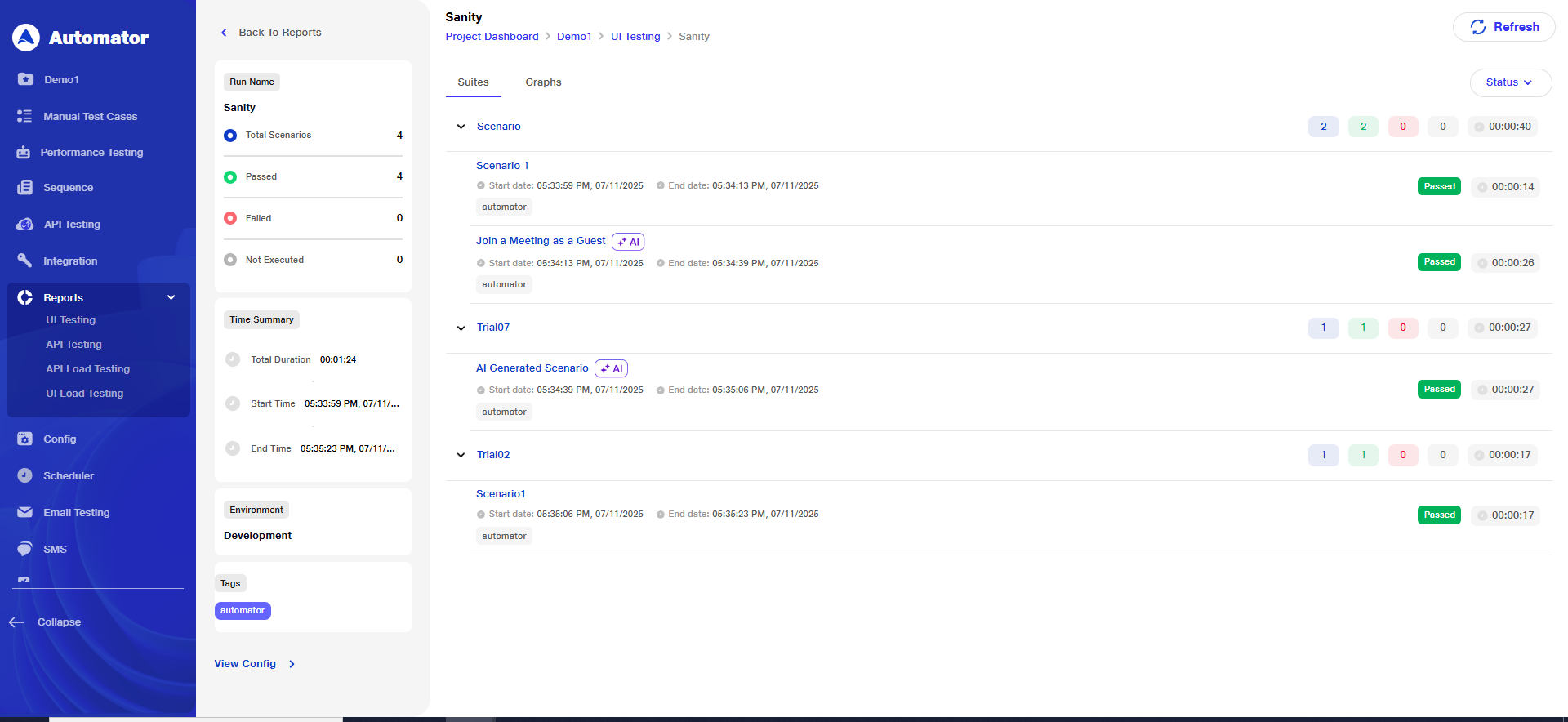
By selecting a specific execution and subsequently drilling down into individual scenarios, users can delve into detailed test results.
These results further give information about each test case, including its status (pass or fail), execution time and any associated comments
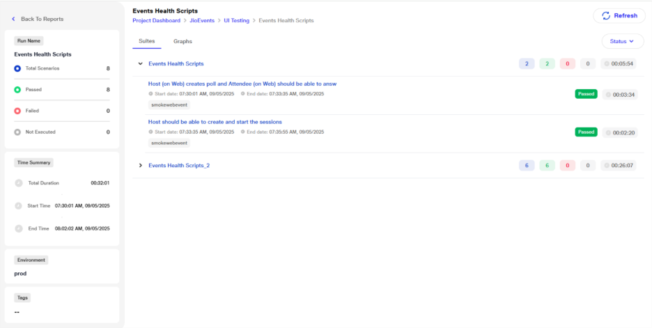
It includes descriptions or titles of the test cases executed, helping users understand the purpose and scope of each test.
For failed test cases, reports typically include error messages, facilitating efficient issue diagnosis and troubleshooting.
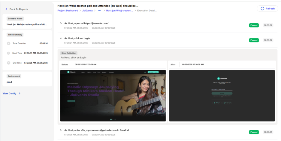
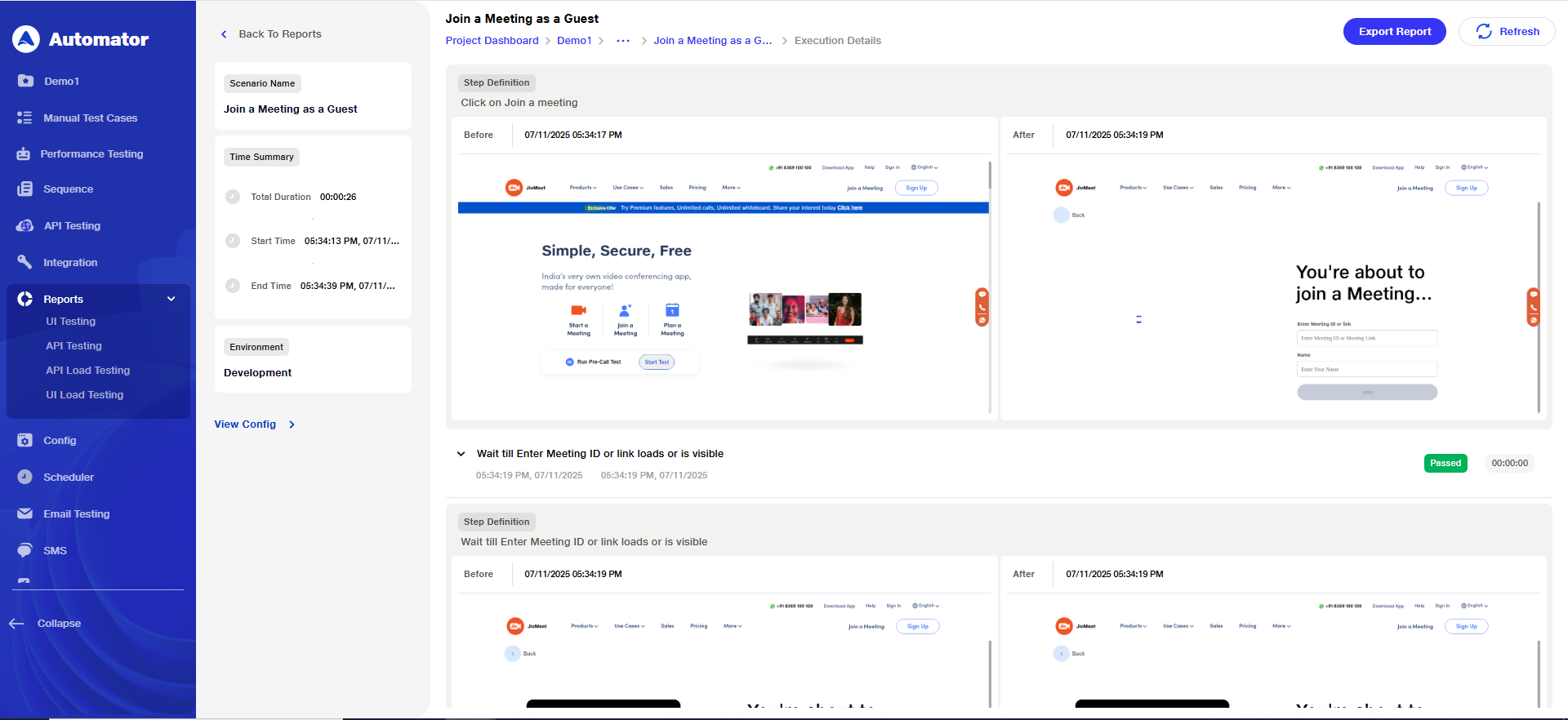
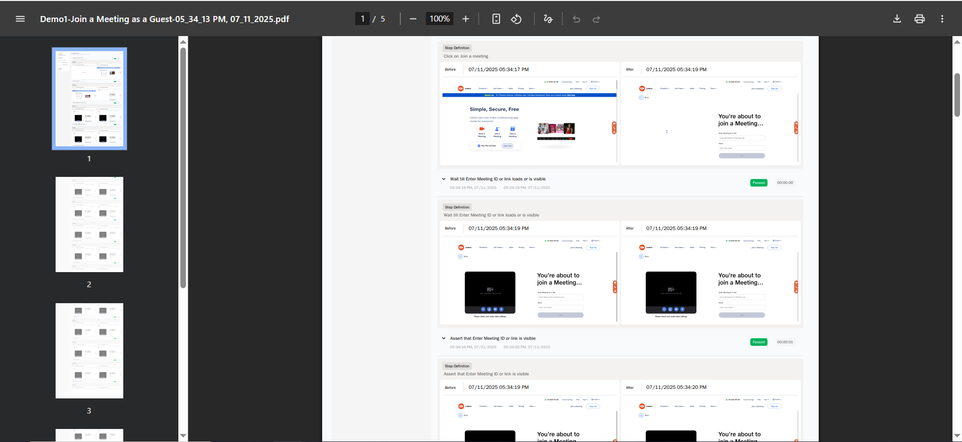
Furthermore, reports may incorporate screenshots or attachments captured during test execution, offering visual evidence of test outcomes and aiding in bug reproduction and resolution.
Upon clicking a test step, the corresponding screenshot captured by Automator during step execution is displayed, enhancing clarity and context.
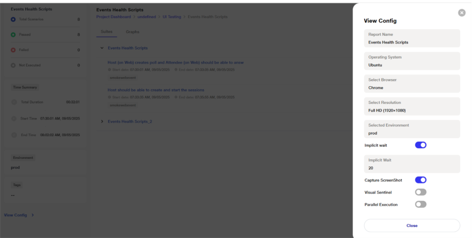
The 'View config' option allows users to access information about the execution environment, such as the operating system, browser, resolution, and any relevant configurations. This contextual information augments understanding and interpretation of test results.
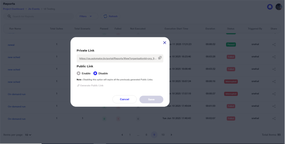
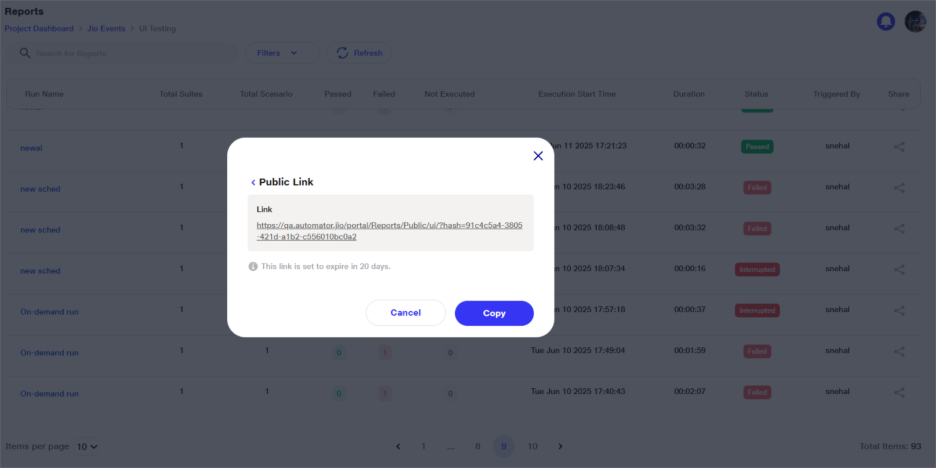
Reports can be effortlessly shared via public or private links generated through the 'share' option, facilitating collaboration and dissemination of pertinent information among team members.
Moreover, reports are automatically disseminated via email when a scheduler is employed for executing suites, scenarios, or API collections.These reports, along with detailed test logs, serve as valuable resources for in-depth analysis and continuous improvement of testing processes.
Multi org reports: You can access report when using through multiple organization if access is permitted
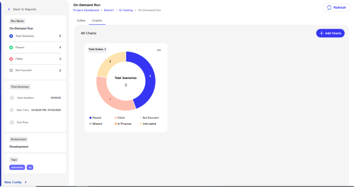
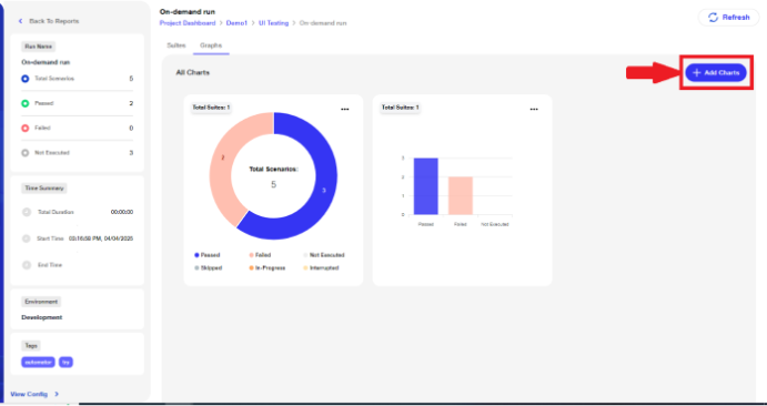
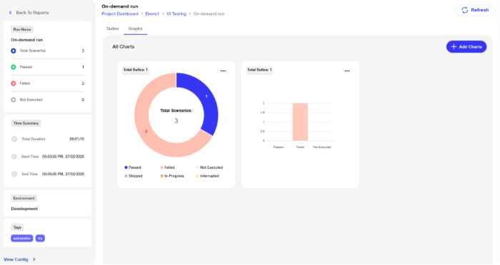
Graphical Reports
The Graphical Report enables users to visualize execution insights by converting summary data into customizable charts—Pie, Bar, and Column graphs. This helps users quickly interpret test performance and status, enhancing decision-making through visual clarity.
View Available Graphs
After any ad-hoc or scheduled run, graphical summaries are automatically generated.
Go to the Reports section of your project, available in UI reports
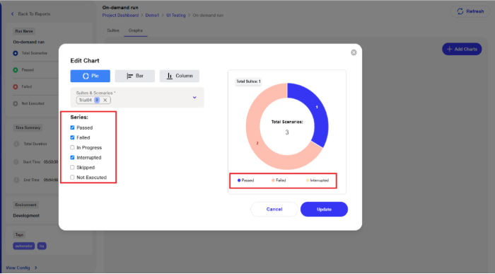
By default, a Pie Chart is displayed.
The chart includes all Suites, Scenarios, and Execution Series selected.
Editing the Default Pie Chart
The system auto-generates a Pie Chart including all data.
To edit:
Click the meatball menu (â‹®) and select Edit.
Modify the Suites, Scenarios, Execution Series, or Graph Type as needed.
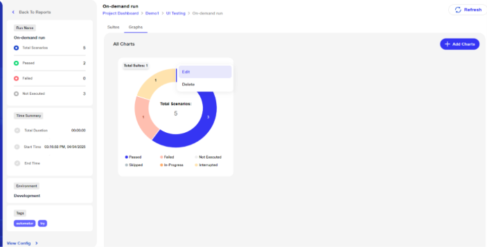
Delete the Pie Chart
To remove a chart:
Click the meatball menu (â‹®) and choose Delete.
A confirmation prompt will appear—click Delete to confirm.

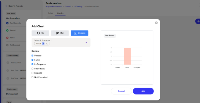
Select Graph Type
You can switch between the following chart types:
a. Pie Chart
b. Bar Graph
c.Column Graph
To change the chart type: Use the available options in the report view to select a different graph type.
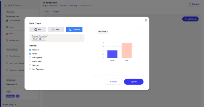
Filter by Suite, Scenarios, and Series
Customize the graph based on the following filters:
Choose Suites and Scenarios:
Select All Suites or choose specific suites.
Further filter by selecting individual Scenarios.
Choose Execution Status Series:
You can choose specific series for display, including:
Passed
Failed
In Progress
Interrupted
Not Executed
Skipped
The graph will reflect only the selected series.
Add a New Graph
Only users with edit permissions (not read-only) can add new graphs.
To add:
Click the Add New Chart button.
Select the Graph Type and and customize suites, scenarios, and series as needed.
Click Add to finalize.
Read-only users: Can view graphs, but cannot add, edit, or delete them. Other users can add, edit, and delete charts
Benefits:
Quick Insight Through Visualization – Converts execution data into intuitive charts (Pie, Bar, Column), enabling faster understanding of test results.
Customizable Views – Users can tailor charts by suites, scenarios, and execution statuses to focus on specific metrics relevant to their goals.
Enhanced Decision-Making – Visual representation of pass/fail trends and execution statuses supports informed QA and release decisions.
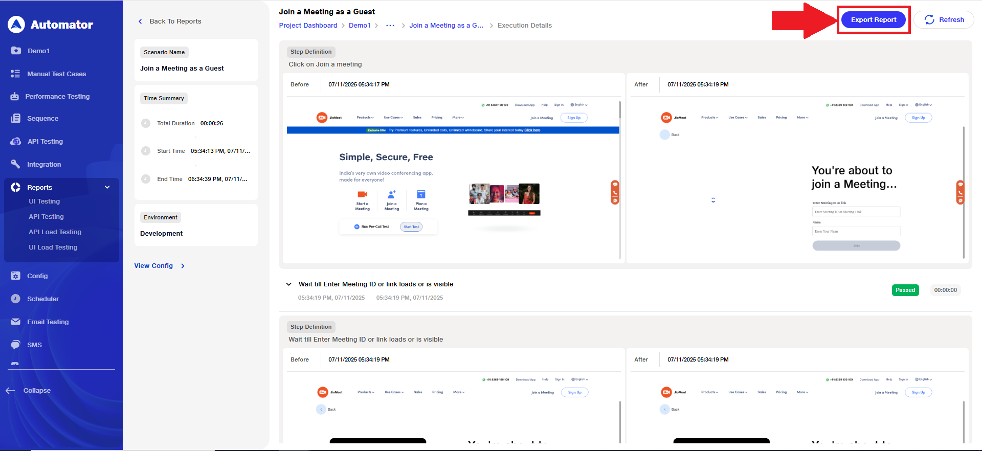
Export Report
The Report Export feature enables users to download detailed reports for specific test scenarios directly from the interface. This ensures easy access to scenario-level insights, supports focused analysis, and simplifies report sharing and documentation for better traceability and review efficiency.
1) Step 1: Locate the ‘Export Report’ Option
a) Open the Project that contains the desired report.
b) Navigate to the Reports section within the selected project.
 c) From the list of runs, open the Run Name for which you want to download the report.
 d) By default, all suites will appear in an expanded state.
 e) Open the required Scenario associated with that run.
 f) On the top-right corner of the page, locate the ‘Export Report’ button.
Step 2: Export the Report
a) Click the ‘Export Report’ button.
 b) Please Note: The ‘Export Report’ option becomes available only after the execution has been completed, stopped, or interrupted.
c) An HTML file will be downloaded to your system, which will contain a screenshot of the entire page for that particular scenario.
Benefits
1) Easy Accessibility: Allows users to directly download individual test scenario reports from the UI without navigating through the entire suite report.
2) Focused Analysis: Enables detailed review and validation of specific scenarios, helping teams identify and resolve issues more efficiently.
3) Improved Collaboration: Simplifies sharing specific scenario reports with developers, QA teams, and stakeholders for quicker feedback and action.
4) Enhanced Traceability: Maintains clear tracking of scenario-level results, improving transparency and audit readiness.
5) Time Efficiency: Reduces effort spent in filtering or extracting data from full reports, saving significant analysis time.
6)Better Documentation: Supports organized storage of scenario-wise reports, contributing to structured documentation and historical reference.
7) Targeted Debugging: Helps teams isolate and address issues at a granular level, leading to faster troubleshooting and improved product quality.